Choose a colour without guessing a whole personality
Use colours the recipient already chooses, while keeping room for context and an easy exchange.
A preference is more useful than a label
Colour becomes less complicated when you begin with something concrete. Perhaps the person repeatedly chooses navy bags, keeps green notebooks or has asked for an orange accessory. Those are usable clues. Describing them as a “blue personality” or deciding a shade must suit their age, gender or occupation adds assumptions without helping you choose an object they will enjoy.
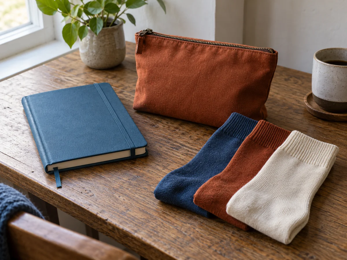
Even a stated favourite colour does not answer every question. Someone may like bright yellow in flowers but prefer quiet colours for work clothes. Consider the item and where it will be used. A small pouch can introduce a bold accent without asking the recipient to wear it across their whole outfit. A large printed hoodie makes a more visible choice and needs greater confidence.
Compare like with like
Screen images are approximate. Lighting, editing and display settings can change how a colour looks, while fabric texture makes the same shade appear different from a glossy printed surface. Look at more than one product photograph and read the seller's colour description. If an exact match matters, ask whether a sample or clearer comparison is available rather than relying on one thumbnail.
Names such as sand, sage and midnight are not standardised promises across brands. Two objects with the same colour name may differ noticeably. A matching gift set is therefore easier when the items are designed together, or when you deliberately choose complementary colours instead of attempting a precise match. A small difference that looks accidental can be avoided by letting each piece have its own clear role.
Let the setting narrow the choice
For a gift used in a shared office or home, consider the recipient's own space rather than a general trend. A strongly patterned object may be welcome, but a neutral practical piece can leave more freedom when you do not know the surroundings. Neutral does not have to mean black: cream, grey, muted green and natural canvas have different care and visibility trade-offs.
The colour can affect function too. A pale lining may help someone find small objects, while a dark outer fabric may show lint differently. A white notebook cover can mark in a heavily used bag. These are practical observations, not reasons to dismiss a shade the person likes. Choose the combination of appearance and use that makes sense for the actual item.
When uncertain, ask a short question or preserve an easy exchange. Avoid adding a name to a colour choice you have little confidence in. A gift receipt and a relaxed note give the recipient room to decide. The thoughtfulness comes from paying attention and making a reasonable choice, rather than proving you can infer every preference without ever asking.
Further information